Jualanmind
Translating Haggling into a Digital Platform
Overview
The goal of this project is to design a compact flow of bidding between suppliers and buyers.
UX Designer, helped with UI Design along the way
Jualanmind is a project collaboration between WIR-Mindstores and PPJI. It is a B2B e-commerce platform aimed for suppliers and buyers in the hospitality industry, in particular restaurants. What differentiates this project from a regular e-commerce website or app is that the haggling process is the key feature that has to be built in the project because it's how the transactions usually happen between stakeholders. This means that the design has to address the bidding flow between suppliers and buyers, and it was a challenge because in real life it's often a random and chaotic process.
Role
Project Sector
E-commerce, B2B
Septian Ade Nugroho (UI Designer)
15+ team of engineers
Team
Project Length
2019
Key questions of the project:
1. How do we simplify the haggling process into a compact user flow?
2. How do we make the process as simple as possible for the many stakeholders?
Research Phase
The first question that we as a team asked was, "What happened in a haggle between two parties?" After we meet the potential users (buyers and sellers) in events and pinpointed the needs, we basically broke down the process into these:
1. Buyers look up for the products (in this case, ingredients) and who sells them while comparing between each of them.
2. Buyers contact the Sellers, and ask for the price.
3. Sellers give the initial price for the Buyers.
4. Buyers and Sellers begin to haggle for the agreeable price for both parties.
5. The price is set, then the transaction begins.
6. After the transaction is finished, the Sellers deliver the products to the Buyers.
The process itself is not too complicated as it's just the usual transaction between two parties. What makes this project a challenge is that each kinds of ingredients have different measurement and expiration dates. There also issues with the price because the suppliers said that ingredients prices are everchanging daily. From this issue we found that we couldn't use the same metric for all transactions, but at the same time if we put too many options it would complicate the process and confuse the users.
The compromise that we did was we first decide on the more general measurements such as kg, g, and etc. We would collect more data on what the users need by opening an "other" option for measurement, and then we would improve the options based on that. As for the expiration date and price, we decided to limit the time of haggling between sellers and buyers so that the prices could adapt with the market more easily.
Challenge and Compromise #1
From this it was clear that we need to pay special attention to the data we gathered to make sure that we provide the correct categories and measurements, also to pinpoint on which kinds of users we should focus.
Understanding the Key Points in the Process
Competitor Analysis
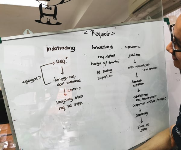
Some of the closest competitor that is comparable with Jualanmind that we found was Ralali, Bridestory, Upwork, and Indotrading.com
1. We need to provide a clear categorization of the products to make it easier for users to search for what they need.
2. In the same vein as the categorization, measurement data is also a high priority to obtain.
3. Websites like these are basically separated into two distinct functions, for sellers and buyers. From the user onboarding we need to clearly separate between the two users.
4. Trust is especially important to have a good customer retention because the transactions involve large quantities of products. As such, reliability and user help center have to be clear on each step of the user journey.
Research Conclusion
The user journey is basically divided between search, bid, transaction, and delivery
Data collecting is especially important in this project
Some limitation for the users have to be implemented to prevent misuse of categorization
On the other hand, the process still needs to be as clear as possible
Separation between sellers and buyers is needed
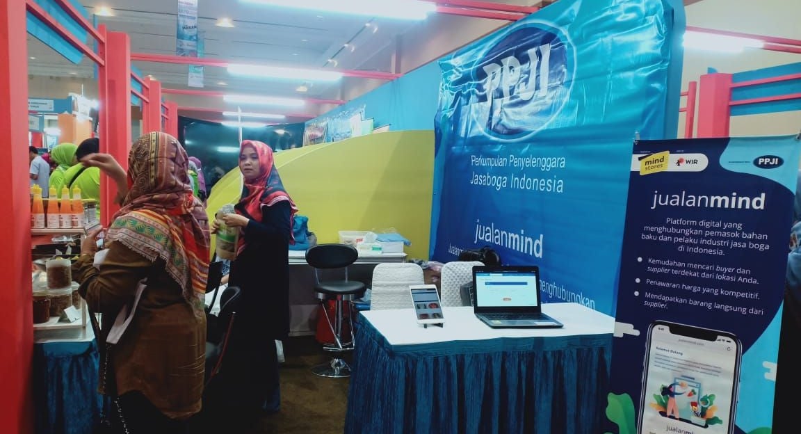
Jualanmind showcase in an event
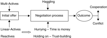
Chart courtesy of ScienceDirect.com
From this we could summarize the process as searching, bidding, paying, and delivering.
Advantages of using a digital platform needs to be emphasized to attract users
Ideation
Since it's a complicated process to go through, we wanted to make sure that every users understand what is happening in the journey, what is being done, and what they need to do.
Brainstorming for the Bidding Process
Right from the beginning of the website we separate the users into buyers and suppliers
Use general measurements such as kg, g, cm, packs, and pcs first
Each step in the user journey has guides and helpers
Text fields for notes and "Other" option are provided for category, measurement, and price
Buyers could ask for a price from several sellers at once
Notifications are clearly present on key points, especially regarding prices and transaction duration
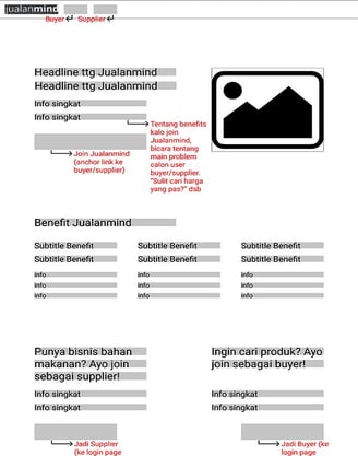
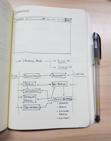
For the separation between sellers and buyers in the onboarding, we decided to use a separate landing page for this issue. This means that we had to design a whole new website to accommodate this decision.
The question that we needed to answer was, should we prioritize buyers or suppliers? The first decision was to balance between the two as seen in the homepage wireframe presented. But in the end we decided to focus on suppliers first to later attract more buyers. As such we catered the content structure towards attracting suppliers to Jualanmind, such as showing user testimony, companies that have joined, number of buyers, and etc.
Challenge and Compromise #2

Based on the research, we came up with several solutions for the pain points
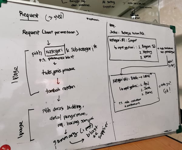
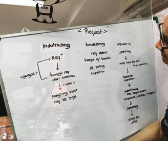
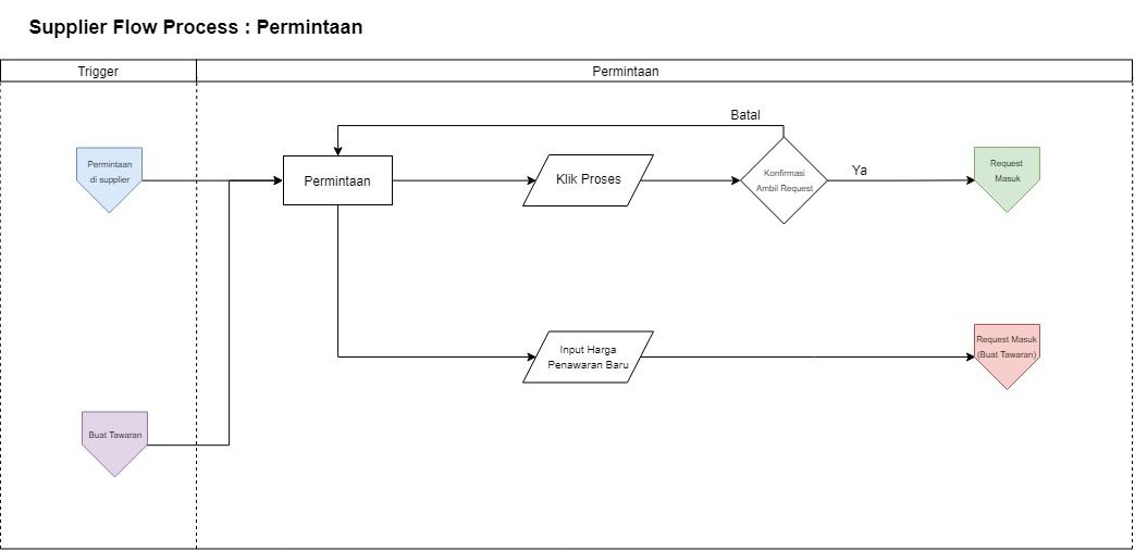
Creating the User Journey
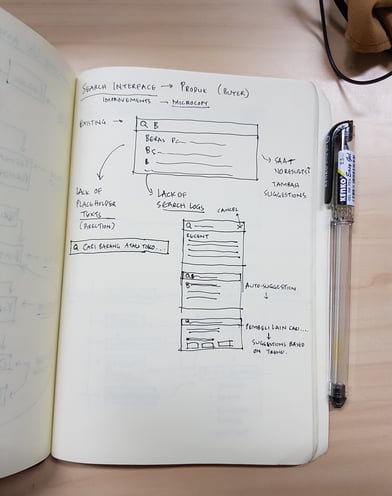
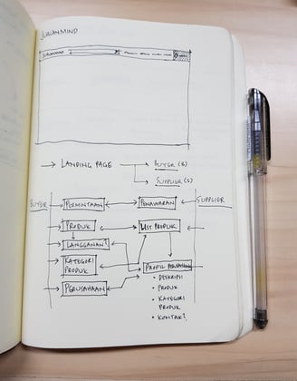
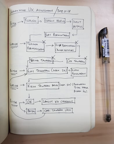
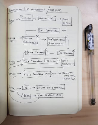
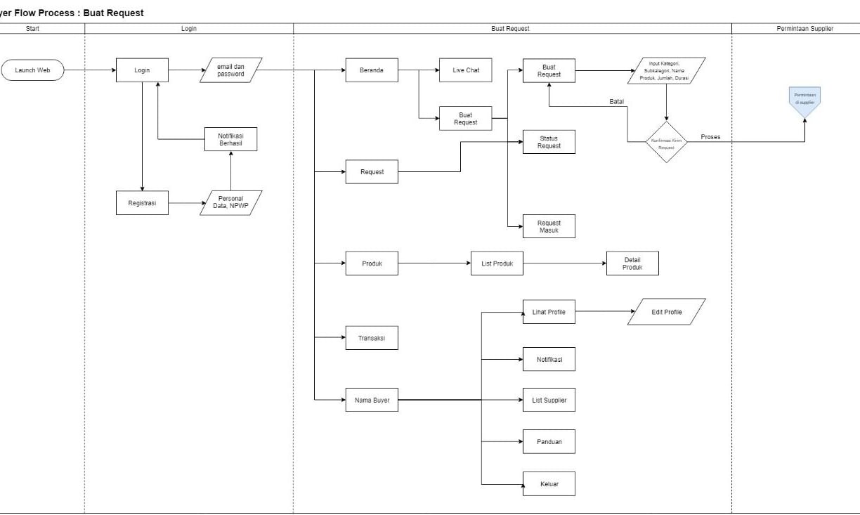
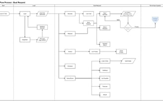
User Flow: Buyers and Suppliers Transaction Request
Visual Design
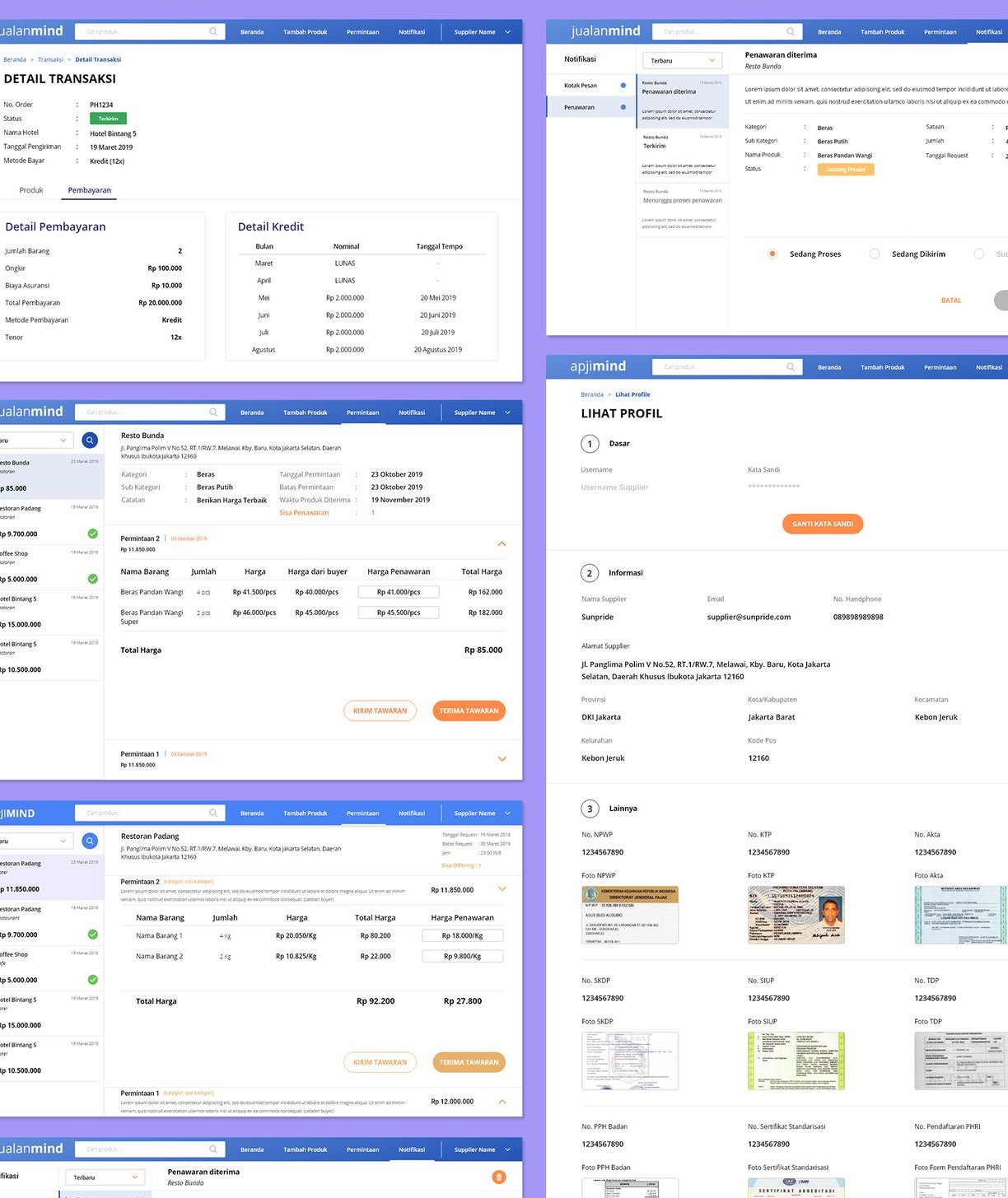
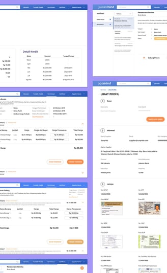
For the buyers
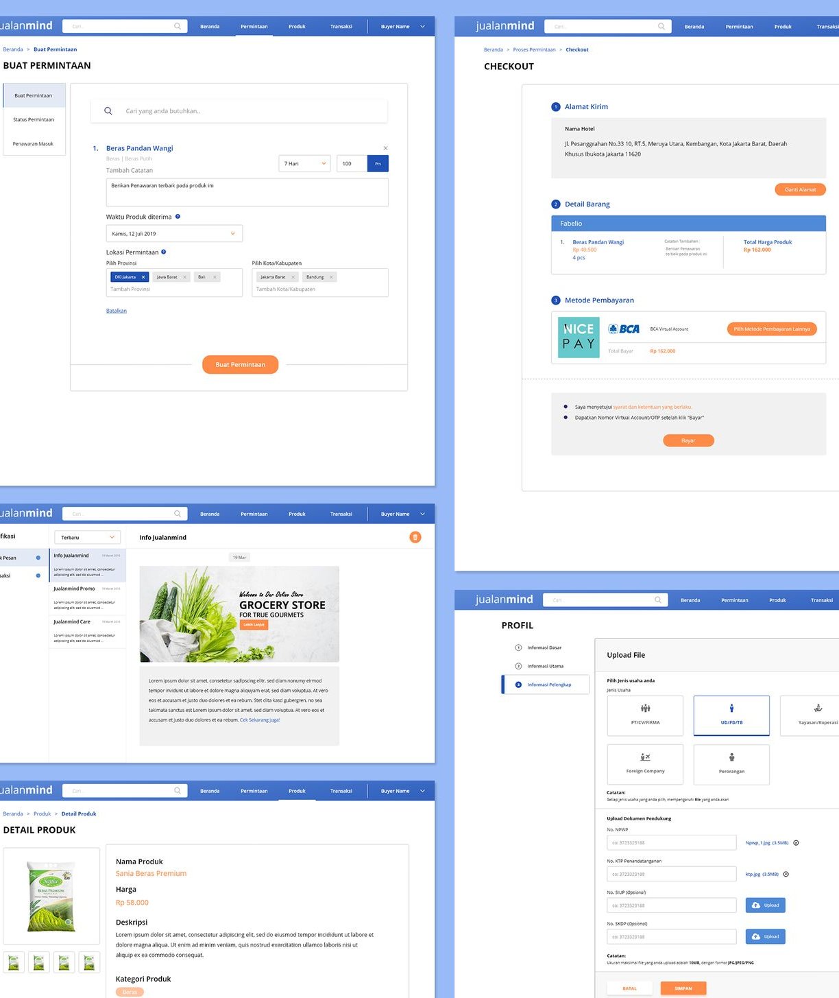
For the suppliers
Lessons Learned
Sometimes many helpers and notifications are fine to first familiarize the users with a unique concept
Experience design means simplifying a need into a clear user journey
Data is key, especially for more complicated projects
What's Next?
Currently the project is on hold when the bidding process was in development. The next feature that was proposed was supplier profile page, and the preliminary concept design was already done.
alwintantowi@gmail.com
Website contents and design by © 2021 Alwin Tantowi

