Alfamind Lite
Redefining a Virtual Store App
Overview
The goal of this project is to redefine the app to accommodate the main user needs, which is for the store owners.
UX Designer, helped with UI Design along the way
Alfamind Lite is a virtual store app partnering with Alfamart that is aimed to enable even lower-income users to open a digital Alfamart store as a side hustle.
Before the Alfamind Lite redesign project began, the app itself was already running for several years with thousands of users. When I joined the project, the team was tasked to improve the existing product one feature at a time, but along the way we realized that Alfamind Lite needed a design overhaul from its fundamentals to the visual design. So we proposed to app redesign from ground up, and eventually it was approved.
Role
Project Sector
E-commerce, Virtual Store
Adriel Aritonang (UI Designer)
25+ team of engineers
Team
Project Length
September 2019 - February 2021
Key questions of the project:
1. What differentiates Alfamind Lite from e-commerce apps?
2. What functions does the users, the store owners, actually need from the app?
3. How do we attract more potential users?
Research Phase
Looking at the user data available, the majority of our users are from the lower-income families, or more specifically, the said families' housewives.
When building a design for the more elderly and non tech-savvy users, there are two important aspects that we need to pay attention to. The first is very-explicit usability, while the second one is readability (if we don't take the visually impaired users into account for now).
Usability alone is usually not enough when facing non tech-savvy users, especially in a developing country like Indonesia. That's why a very explicit approach is needed, typically with clearer contrasts and explanations for every actions. Readability is also one of the main focus, and it doesn't only involve text sizes but also contrast between texts and contents. This involves aforementioned size, positioning, color, and font type.
Many visual design in the app were messy on smaller phones and phones where the users change the text size. This disrupted the usability and readability.
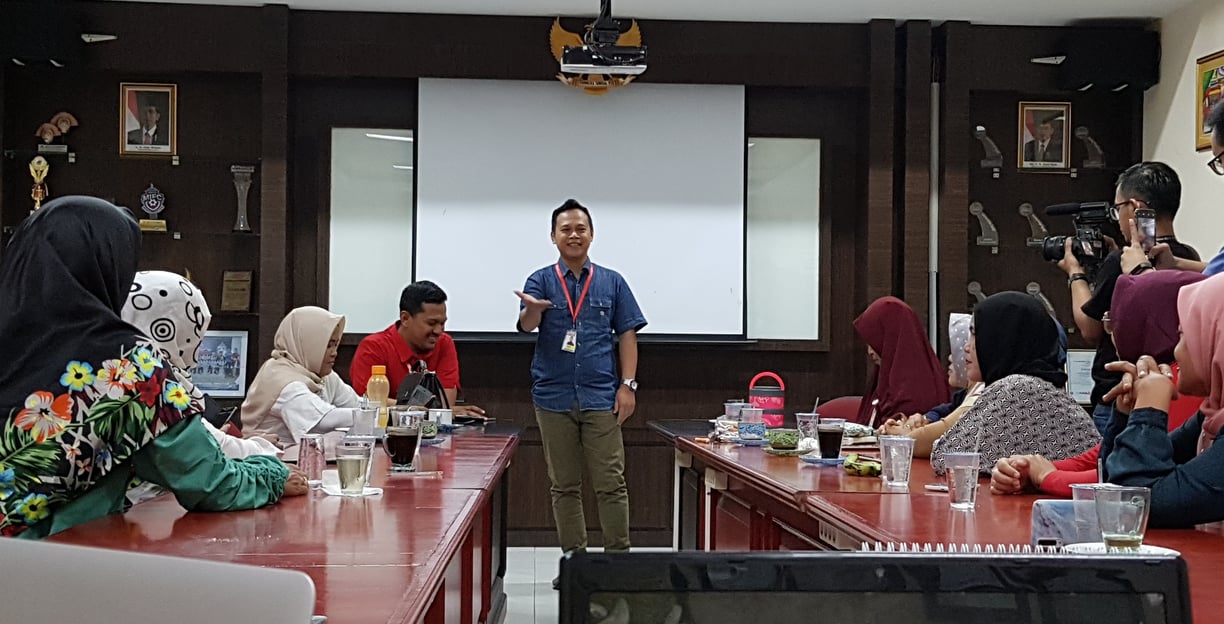
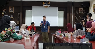
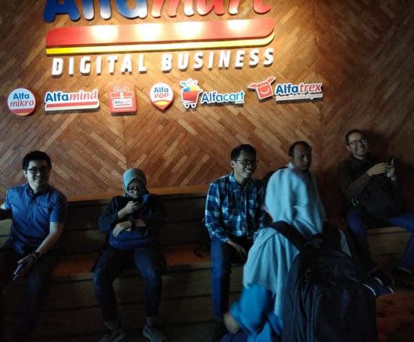
When there was a store owners gathering in September 2019, we conducted a direct observation on users navigating through the app. We found that :
Direct Observation and User Interview
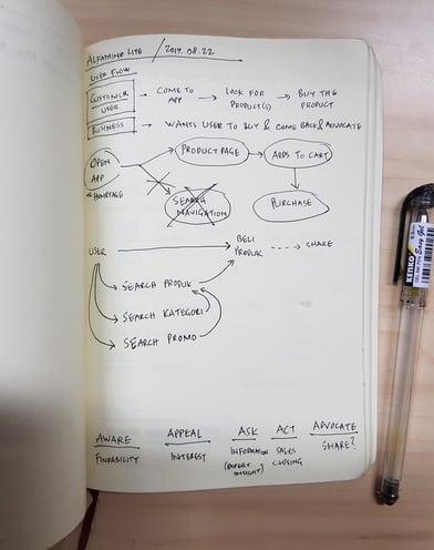
The more we analyze the user journey, the more we realized that we need to do a content restructuring for the whole app from user onboarding to advocating to other potential users.
Who Are the Users?
1. The users are non tech-savvy, but they could navigate through the different user flows just fine. The main issues are there are many design language that they're not familiar with and several readability issues.
2. Since some users have problem reading small texts, they enlarge the texts on their phones. This results in a chaotic interface on said phones. An adaptive design would be needed to address this issue.
3. The users were having problems selling products on the app, because the existing app were made as an e-commerce app, not a visual store app. From this we know that we need to switch the target users from buyers to store owners.
Internal Findings
Before we propose the total design overhaul, we looked into the problems and we found several important issues to address as soon as possible :
1. Update the visual design to the current trends since it affected the attractiveness of the app for new users.
2. We need to improve the performance of the app because there were many issues on transactions as pointed out by the users. (This was a note for the engineers)
3. We need to redefine the user journey since we decided to change the target users from buyers to store owners.
Research Conclusion
Redefining the target users from buyers to store owners is needed
Improve the readability, dependability, and accessibility of the app
Information architecture restructuring is needed because of the target user change
The features must accommodate what the store owners need, not just buyers
Update the visual design to current trends
User observation and interview on September 2019
Alfamind Lite is a virtual store app, not an e-commerce
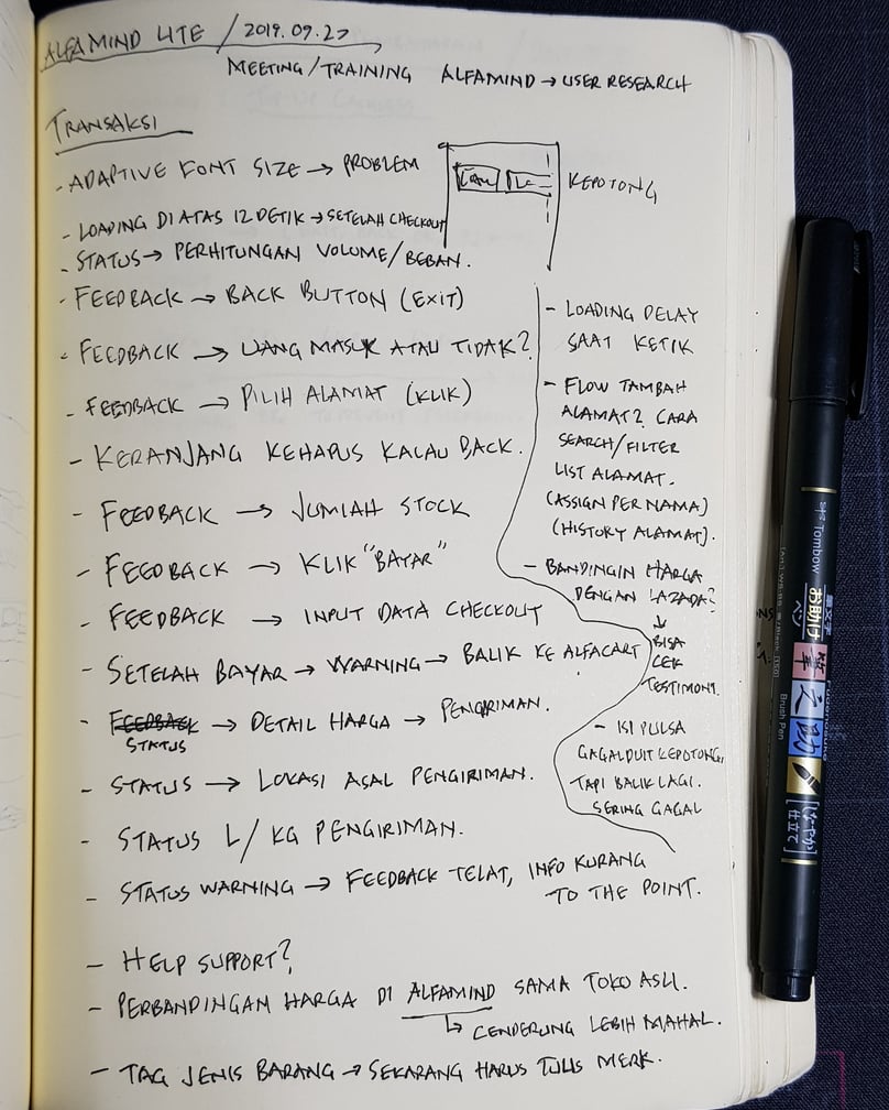
From the pain points gathered from the interview, we found that the majority of users mainly concerned about transaction, visual clarity, and app performance.
Ideation
From the visual design standpoint, the main objective is to make the app as readable and accessible as possible for everyone.
Brainstorming for the Content Structure
Clear blocking between different groups of contents
Clear and consistent CTA components position and sizes
Putting the most important navigation and information at the front
Eliminate all hidden features accessible by gestures, changed into buttons
Improve educational information for the users since the functions are unique to this app
Adaptive design, especially towards smaller devices
We wanted to make an infinite scrolling product search to improve user engagement. The issue was it's not feasible from the technical side and since we wanted to improve the app performance, the idea was scrapped.
Challenge and Compromise #1

Challenge and Compromise #2
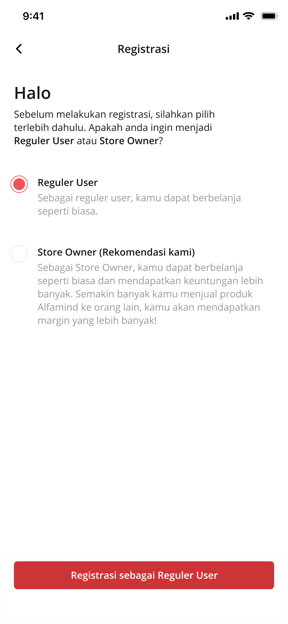
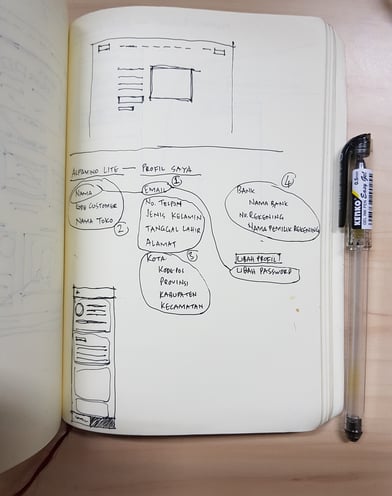
At first we wanted to separate the users into three, guest users, regular users and store owner users, since we want to make the app easier to access for new users because signing up as a store owner right away is a magnitude more complicated than being a guest and regular users (Need KTP, bank data, and etc). But our partner requested that separating the users could complicate the marketing side since it would need additional education for the users, so in the end we changed it into an incremental level of users, from guest to regular store owner to verified store owners. The users are not informed on which one they are, they are just prompted to complete the data needed.
Challenge and Compromise #3
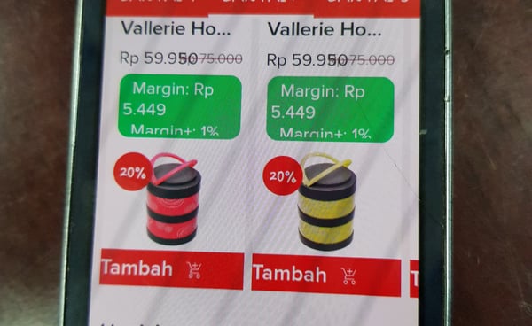
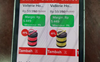
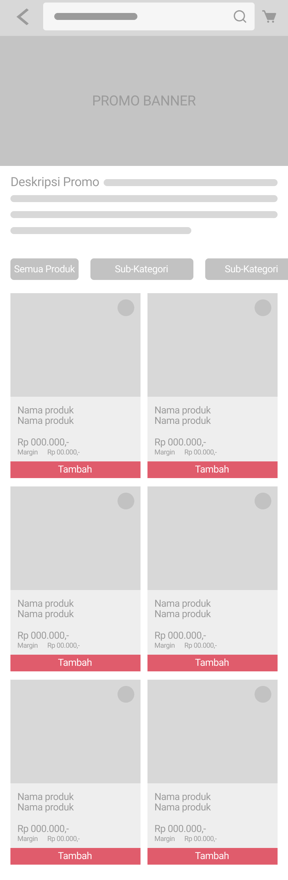
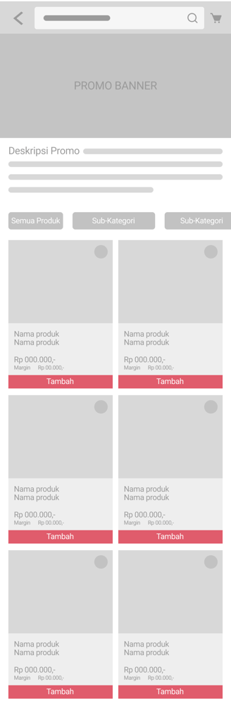
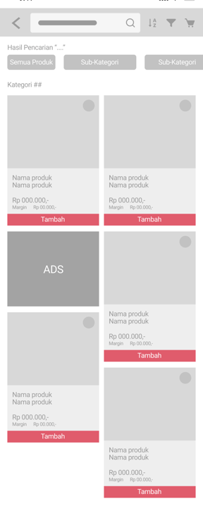
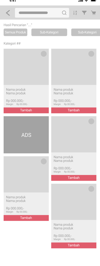
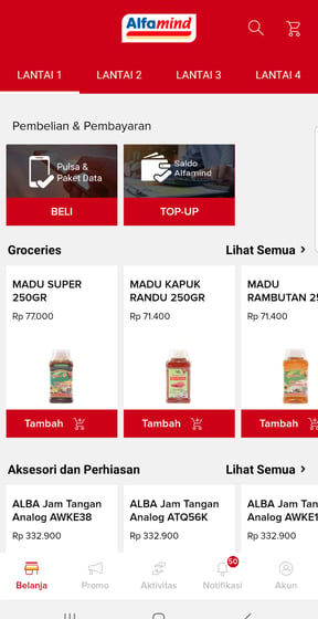
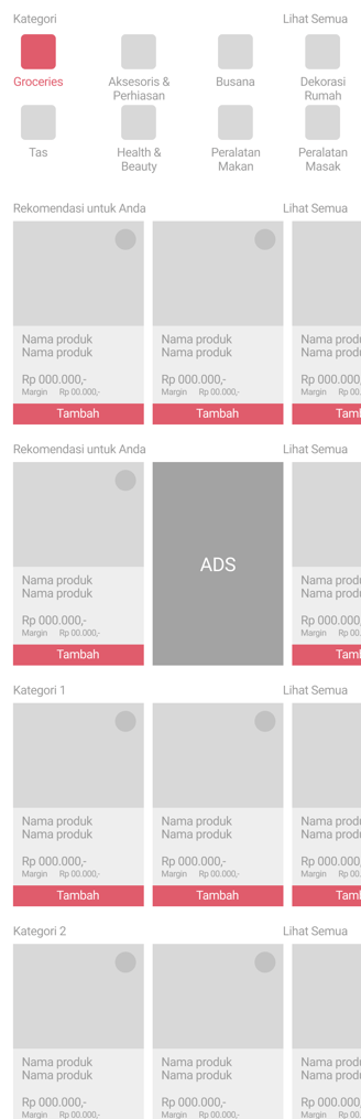
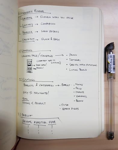
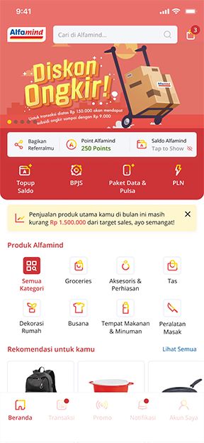
The existing app separates the products into different "floors" to simulate real-life stores and also for easier data categorization for both admin and users. We decided that this made some products too hidden for the users, so we removed the "floors". As a compromise, to make it easier for store owners to quickly search a product their customers want to buy or window-shopping, we put a Category section at the top of the homepage.

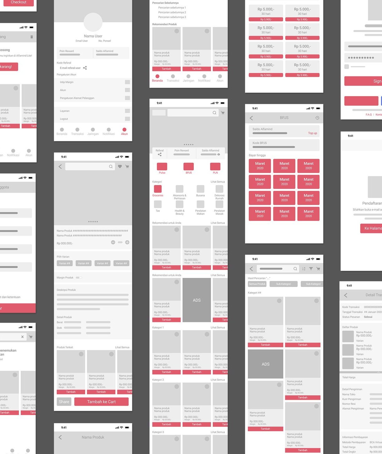
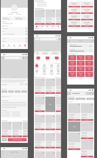
Key Takeaways From the Wireframe
1. We moved some usually more hidden functions such as Transaction History and Wallet to the front page because store owners frequently access them to check their ongoing transactions.
2. We remove some sub-menus and put the contents at the front to make it easier for users to search for them, such as in the Account menu for example. We want users to be able to directly access different menus without going into each sub-menus.
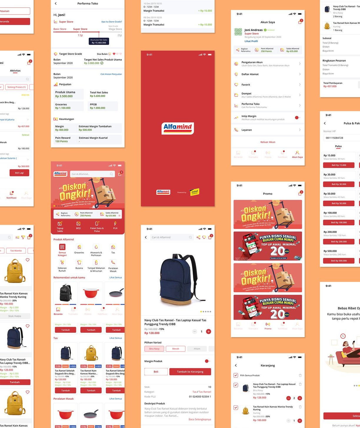
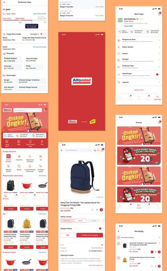
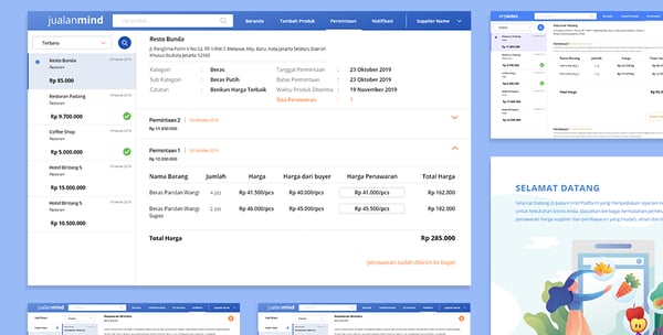
(Existing Design)
Based on the research, we came up with several solutions for the pain points
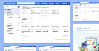
Visual Design
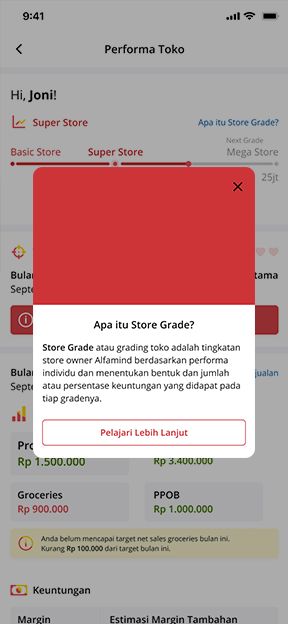
In the middle of the development a new feature was added, which is the Store Performance (Performa Toko). Store Performance's main function is to inform users about their store's performance for a period of time and their monthly/quarterly sales targets.
Since this function is a quite complicated one, especially for non tech-savvy users, we decided to add notification at the homepage and put more emphasize on user education in the Store Performance page. Impacts to the design was also analyzed to make sure that this major design update could seamlessly blend with the overall flow (and for the CMS too).
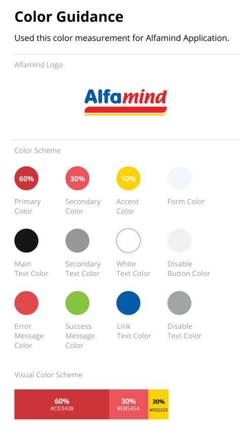
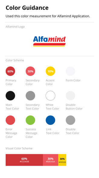
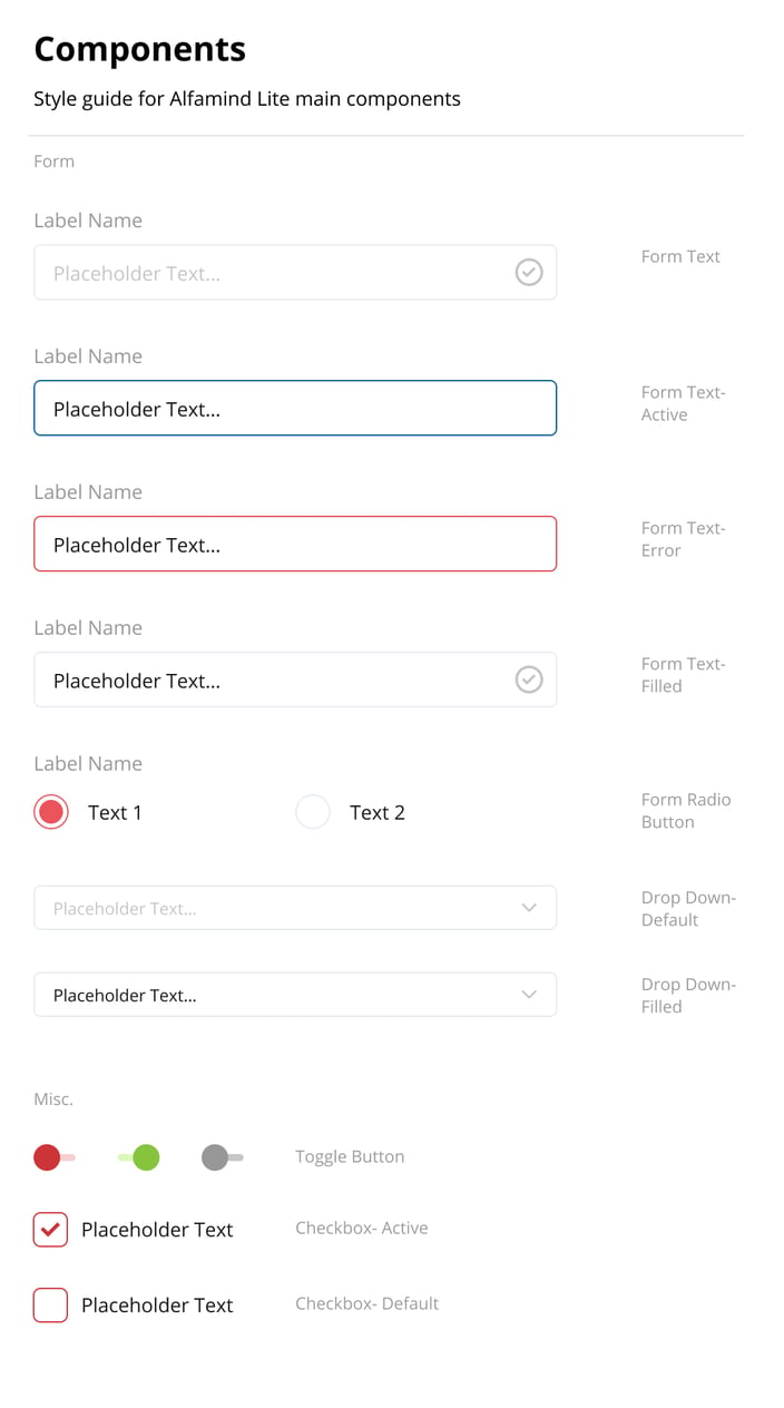
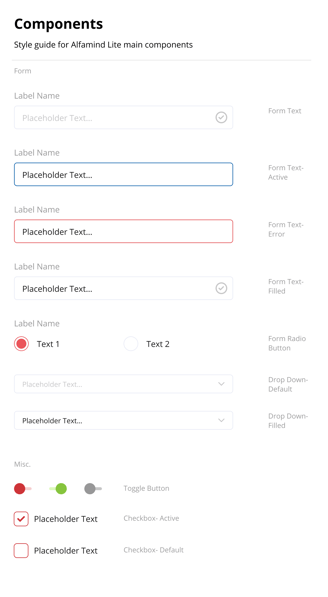
Design Guideline
Challenge and Compromise #4
From the front page, the design is tailored for store owners' needs. They can immediately access Wallet, Categories, Notification, Transactions, Referral Share, and Top Up.


Design Addition Impact Analysis for Grading Feature
Lessons Learned
Mistargeting your project's users could result in a significant redesign effort
Involving engineers in the design process to know the constraints in a project is important to understand the limits of your design outcome
Ensuring that the design process is properly done from user research to prototyping is important to make sure that you don't need to redo the design process all over again when there is something that is fundamentally wrong
What's Next?
Currently the project is in development and it's expected to be done by February 2021. After the development is done, we could research the overall usability through user feedbacks. There are also several new features that will be expanded upon, such as a personal store for store owners.
alwintantowi@gmail.com
Website contents and design by © 2021 Alwin Tantowi