Alfamind AR
Enhancing the Virtual Store Experience with AR
Overview
The goal of this project is to tailor the app design towards AR-supported virtual store experience for the users.
UX Designer, helped with UI Design along the way
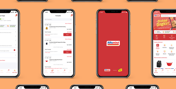
Alfamind AR is a virtual store app partnering with Alfamart that is aimed to enable even lower-income users to open a digital Alfamart store as a side hustle. The key difference between this project and Alfamind Lite is here Augmented Reality (AR) support is implemented to enhance the user experience throughout the store.
In a similar vein as Alfamind Lite, this project was also already ongoing before we began the redesign process. The triggers for the overhaul project are the renewal of Alfamind Lite, outdated existing design, and the need to enhance the AR experience on the app.
Role
Project Sector
E-commerce, Virtual Store, AR
Septian Ade Nugroho (UI Designer)
10+ team of engineers
Team
Project Length
April 2020 - Ongoing
Key questions of the project:
1. What makes a great AR experience in an app?
2. How to enhance an existing experience with AR support?
3. How to make AR experience not just a gimmick?
Research Phase
Augmented reality is still a new industry in the technology world, but it has seen a significant growth in 2020 and expected to grow even further in 2021. Alfamind AR aimed to use AR to enhance users' shopping experience with Alfamind. The issue was, in the old design the AR feature itself was not the main focus, instead it's just an add-on on top of an e-commerce app (which is also wrong in itself since Alfamind is a virtual store app, not an e-commerce app).


We needed to pinpoint on what would make the user happily use the AR feature without obstructing the main purpose of the app, which for Alfamind AR is shopping.
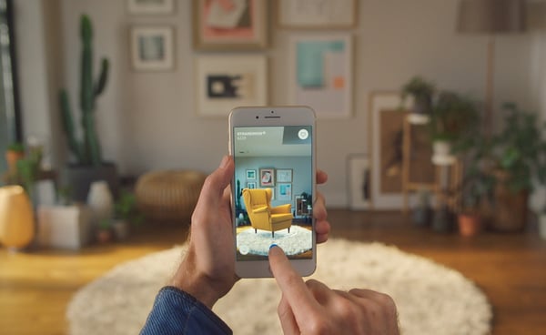
As of writing (2020) there aren't still too many examples of AR app, not to mention virtual store AR app. In the end we used IKEA Place and Sephora AR as examples.
Competitor Analysis

All in all, designing an AR-focused app needs a different approach from traditional UI/UX design. It needs to take into account on what the users want and need when we blur the boundaries between reality and digital.
AR as a Focus, Not a Gimmick
1. In both app, the AR feature are positioned front and center for users when they access either the app or the product detail page. This ensures that users know the existence of the feature and use it.
2. The AR feature itself doesn't obstruct the main experience. If people just want to shop, they could just skip to checkout and not be bothered with the AR feature.
3. The AR usage is based on what the users need. In IKEA it's for placing the furniture in your room, while in Sephora it's for comparing between different make-ups. In Alfamind AR we haven't defined for what exactly is the AR for.
Literature Research
Based on different sources of literature, we could conclude that:
1. Part of the reason of the rising trend of AR is it's relatively accessible for most users with smartphones without needing additional equipment like how VR is.
2. As such, we need to take into account the ease of use of the AR feature for users, such as safety warnings in rooms and setting the space requirement expectation for the users.
3. Implementing AR means minimizing inputs that should've been needed without said AR implementation. As such the transition to using AR needs to be seamless (but still clear, to ensure users' safety).
4. Emphasize on visual cues is needed to inform users on what they could do with the AR feature, such as arrows to point out that the object could be rotated and etc.
Research Conclusion
Changing features focus towards Augmented Reality
Define what the user needs from the AR feature
Implement visual cues for clearer transition to and fro AR
Making the AR not obstruct the shopping experience
Accommodate the visual design for AR experience
Augmenter reality illustration
In the existing app, there are two main problems with the implementation of the AR feature. The first is that it's too hidden inside the app, it's as if it's just an add-on that was added on last minute. The second issue is many times the AR itself becomes a hindrance for the user experience. We need to remember that most users (lower-middle income users) don't have state-of-the-art devices, so the AR feature could make the app performance too heavy. The AR feature in the front page also inhibits users from quickly do what they want to do in the app, which is buying products, because they were forced to go through several animations and loading time.


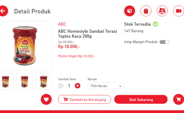

From analyzing the existing design, we could summarize that prioritizing the AR feature is needed and as the designer we also need to provide a seamless transition between AR and normal experience to not inconvenience the users.
Users are forced to go through 3D stores and floors to find their desired products, thus inconvenience their shopping experience
The AR feature is hard to find in the existing design, even though it should be front and center
Image Courtesy of ikea.com
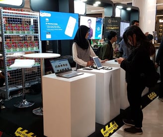
On Disrupto 2019 when we showcased Alfamind AR, general public showed enthusiasm in AR
Ideation
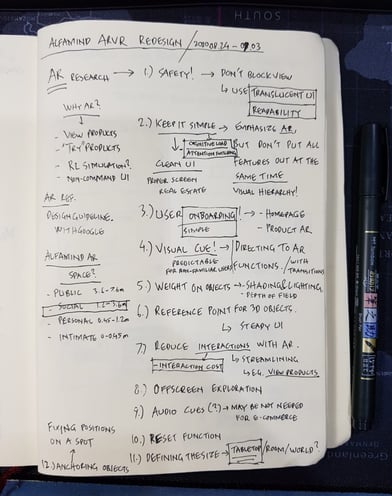
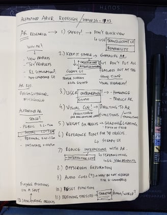
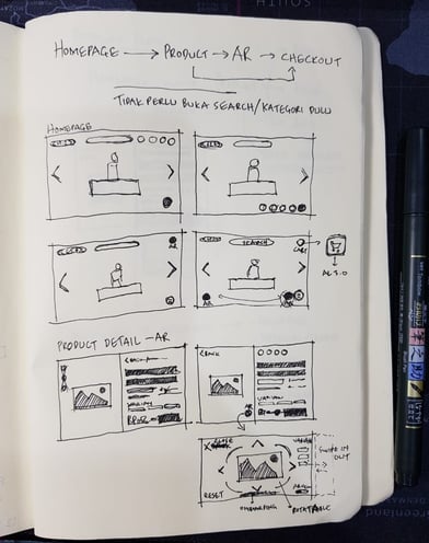
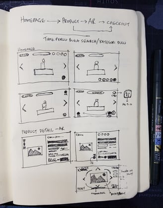
Research, Brainstorm, and Sketching for Ideas
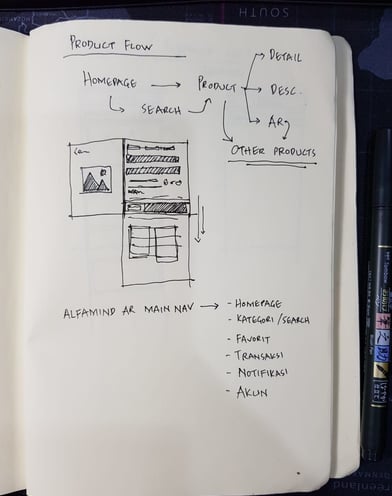
Remove the virtual "floors" on the design, emphasize on search function instead
Landscape orientation to accommodate AR experience
Emphasize on images to attract users on the object
Clearer prompt on when the users could use AR and when they're not
Clear visual cues on AR experience
Even though AR is new in Indonesia, keep the feature as simple as possible
Emphasize on AR means that some visual elements are bigger from usual, and thus some compromise in content presented needed. One example is I needed to take out the Categories from the homepage, putting them entirely behind a Category sub-menu.
Challenge and Compromise #1
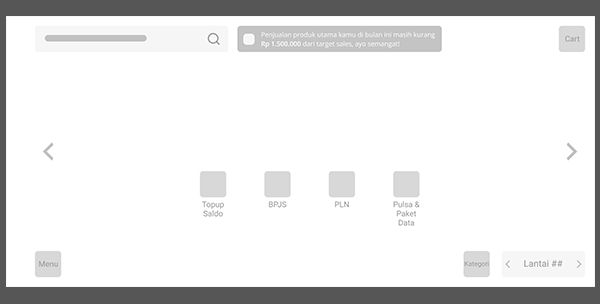
Key Takeaways From the Wireframe
1. Adjustments in experience from Alfamind Lite to Alfamind AR is needed because of the existence of AR feature. As such, user onboarding such as Customer Service (Layanan) was taken to the front instead of hidden inside the Account page.
2. We made it clear for the users when AR feature is present by signifying the portion of images on the screen to make sure that they could prepare the space needed before they move around. Some forms of warning and notifications are put to instruct them on how to interact with the 3D objects.
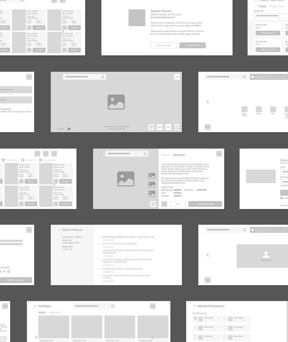
Based on the research, we came up with several solutions for the pain points
Challenge and Compromise #2
Some features that was planned to emphasize on the AR experience couldn't be implemented because of technical limitation from both front end and back end, and from the users' side too. Some examples are the 3D data of the products that we needed aren't done yet, so the AR on some products need to be disabled. We compromise this by adding information such as "3D will be available later!". Other feature is we couldn't make a full AR experience when shopping because it would be too heavy on general users' phones (lower-end Android phones). As such we still couldn't put the feature front and center like how IKEA Place did, but we still make the option clear enough to see.
Visual Design
Recreating a UI from portrait to landscape orientation was harder than what I usually thought. Several features and content hierarchy needed to rearranged to suit the new orientation.
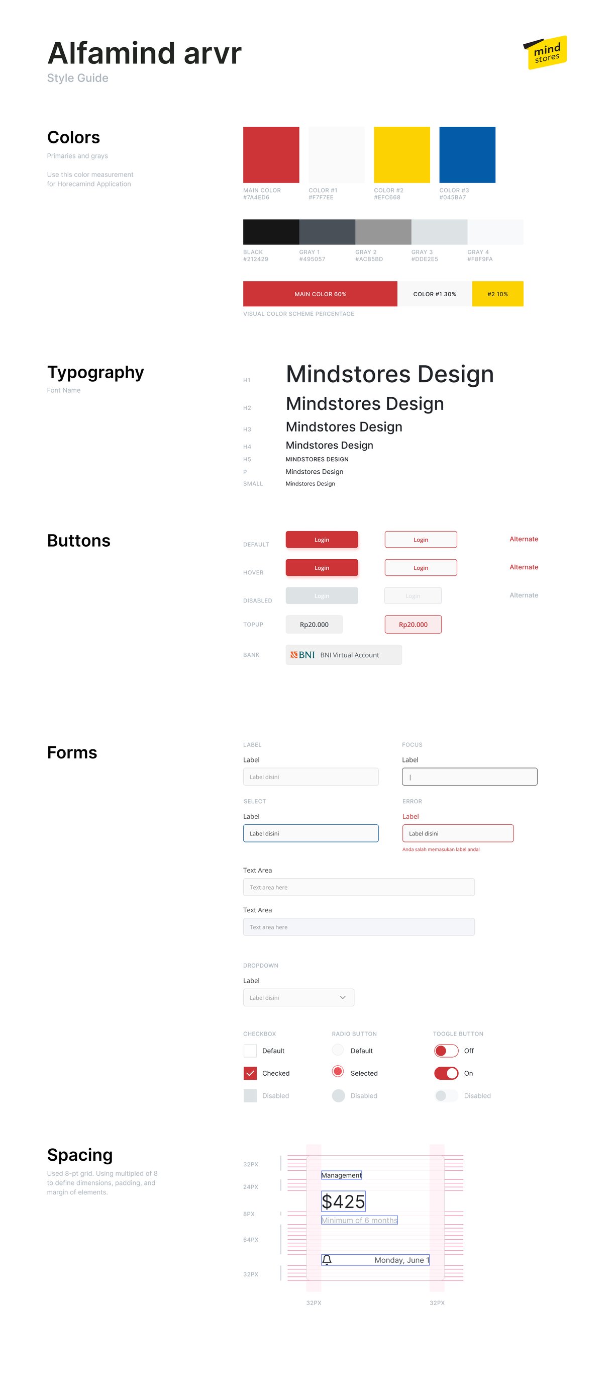

Design Guideline
Challenge and Compromise #3
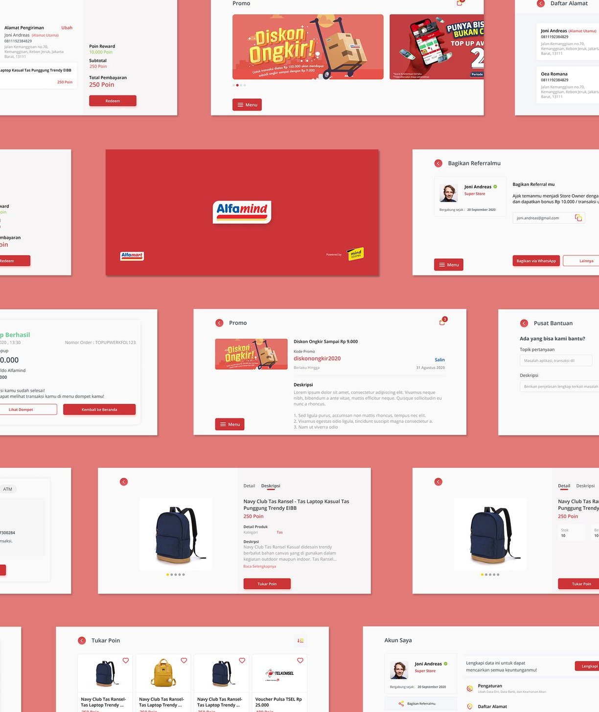
Designing for a seamless AR experience while ensuring users' convenience and safety when shopping

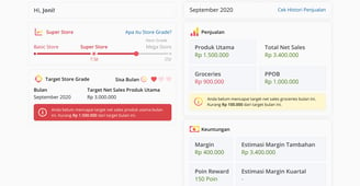
*as of writing (01-2021) the UI design is still in progress
Lessons Learned So Far...
Designing a landscape oriented UI needs a different point of view from designing a portrait one
Involving engineers in the design process, especially for new features such as AR, is especially important to know the constraints in a project is important to understand the limits of your design outcome
Designing for AR means blurring between the digital and physical world. As such we have to make sure that users' safety is the number one priority to prevent unwanted accidents
Putting AR as the main feature of an app could give a negative effect for the app performance. It's important to first pinpoint what the users need and do they actually need and want an AR feature. Business objective comes first before gimmicks.
What's Next?
As of writing, the design process is still ongoing. It's expected to be done on around February 2021. More advanced AR features such as interaction with physical objects may be implemented in the future, if it's technologically feasible in development.
alwintantowi@gmail.com
Website contents and design by © 2021 Alwin Tantowi

